Sunday, October 19, 2014

A Paradise's Website in Retrospect

Simplicity is Beauty

Want to have a taste of paradise? Experience local hospitality amidst the untouched water and natural landscape of an island? Relax and celebrate life away from distress of a busy city? Then, pick Palawan. Choose El Nido Resorts.


(http://www.elnidoresorts.com)

A group of eco-resorts located in the El Nido-Taytay municipalities in northern Palawan in the Philippines, El Nido Resorts offer genuine, local hospitality as well as unique and enriching experiences through the beauty of nature. True to its claim, the images chosen for the website reflected El Nido Resorts as resorts founded in an ecologically gifted area. There is fairly a number of web pages dedicated to expose El Nido Resorts’ efforts in exercising stewardship over the flourishing diverse environment and stressing the importance of preserving nature.  The resorts’ management unquestionably embraces a strong commitment to sustainability.
This must be the voice that the website tries to express. Let's then take a closer look at how the website led its visitors to see more and experience the place.

The Elements: Lines, Shapes, Texture, Color, and Direction
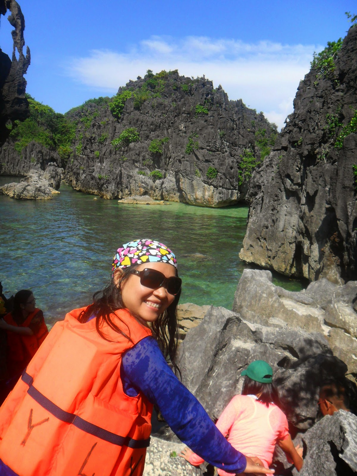
Representing a sought – after tourist destination, the El Nido Resorts website lets you experience nature in its virtual presence. Its homepage consists a cycle of images – the pristine waters, the majestic rock formation and the scenic landscape of El Nido, Palawan. The lines and lineworks on the homepage and the rest of the web pages perfectly reinforce its content and overall site structure. Fine lines work well in drawing the eyes into the images of the resort, as placed it the header and footer. The main navigation at the top part of a web page directs the users in moving around the website.

Predominantly in squares and rectangles and in sharp edges, the shapes are instrumental in depicting the panorama of El Nido. There is a smooth and natural feel of the imagery. The website’s overall texture will certainly move you to go around the pages as you feel rejuvenated at the sight of the images. The colors too, are relaxing to the eyes. Making use of white as its prime background effectively pulled the eyes to the picturesque imagery of pristine waters, natural landscape and clear sky. The choice of the color scheme makes the content readable. It also leaves the impression of experiencing nature and a desire to take a time off from the busy lines of work. The pictures, on the other hand, would further reinforce the content of the site. Two or three other small images added at each page is not much to ask, right? It is also a must that the images in each page works well. I noticed that in some pages, images cannot be seen. There must have been problems in uploading it. Some sort of website maintenance for this matter would certainly ease out such concern. It would be regretful for the resort management to find out that a potential visitor had slipped away because of a non- uploading image on its website, don't you think?

In the end, the elements perfectly served its purpose of revealing beauty in the website in its simplicity.


The Principles: Balance, Contrast, Emphasis, Rhythm and Unity

Less is more. The simplicity of the design of El Nido Resorts’ website brings forth the invitation to experience nature. The website has maintained balance as well as contrast in their web pages. Navigating through, you will find a common site structure – that it a panoramic view of the places in El Nido in white background, and the body content after that primary image. A small image is also placed at the right side and is harmonized by sub – navigation on the left side. The font size and font type also depicted a relaxing mode. The font color in black augmented its white canvas.


The information architecture is also well – designed. A little is presented on the homepage but it gave movement and clear direction to the user to go where he/she wants to go. The most important information is taken up the top. There is a gradual filtering of the information down the page where the least important can be read. This displays the hierarchy of the content. Essential and substantial details are capsulated in every page, and are further accentuated by few pictures and links. This would prompt online visitor to not just know further about El Nido resorts but more to experience that paradise in Palawan. It is without a doubt that visitors of the website would contact resorts personnel for a vacation in mind. More so, if that page about the virtual tour in the resort of El Nido is placed at the main navigation right at its homepage, the experience on nature will further be emphasized.

The website has amazingly kept its consistency and coherence. The image size, headings, text fonts and colors are standardized in every page. The images, texts and formatting of the website have formed the impression to potential costumers about its brand or identity. It has achieved unity and rhythm in the design by means of the themes aligned to its content.

The Impact: Celebrate Life in God’s Majestic Creation

The website maintained its focus – that is, celebrating life by experiencing nature and be a steward of God’s majestic creation. The simplicity of the website design has attained beauty of nature. The elements were harmonized to realize a site that is appealing, relaxing and rejuvenating.  It has effectively drawn its target audience to experience tranquility and a time off to recharge and be with nature. Thus, the concept behind the design has perfectly matches the content. Consequently, visitor of the site will be in great desire to experience the place and share a journey with the people of El Nido. It is about a personal encounter with local hospitality, culture and care for the environment.

The website interface and navigational structure is intuitive and allow the user to find the content quickly and effectively. It presents a first-rate visual communication achieving relevance and appropriateness for its target audience and most importantly the message it wishes to put across.

Moving around the website takes you to a journey in El Nido, Palawan. The website, in its entirety, places El Nido in every calendar and pictures frames of its visitors. The simplicity in its presentation highlighted the beauty of nature at its finest in El Nido. Who wouldn’t miss a time and opportunity to share this wonderful adventure with your loved ones? Experience Palawan. Visit El Nido. 


With El Nido Resort website in retrospect, here are some other reviews about the site as presented by my co-learners in Multimedia Applications 2 in SCOPE. It would be more evident now, as your read through their reviews, that finding beauty is by means of highlighting simplicity. Here it goes:


The websites’ layout looks very appealing to the users. It uses images of the beauty of nature which is very pleasant to the eyes of the viewers. The design uses white color background with the emphasis on crystal-clear waters. There is a placement of strong visuals on the first section of the page. Although the logo is quite simple but it matches the very relaxing images of the resort. For the navigation, all the links are found at the top which allows the users to find the content quickly. The viewers can easily search the types of services they are interested with. The emphasis of the design solely focuses on the wonders of nature – its beautiful landscape. As a whole, it is indeed an attractive website that is very catchy to the viewers.# Blanca Dimaunahan, University of Makati


Because of this site’s simple layout and attractive pictures of the resort, it would attract anybody who would visit the website.  There are beautiful pictures of the place and the whole island that anybody who would see this website would dream of going there.  It’s good seeing all the links on the main page are all of the links right up the top.

The layout makes you feel comfortable with the site because it is very simple – title, links, text, design, graphics.  Very well done!  The design is very effective.  I like its simplicity. It is easy to navigate through the site because you know the links are going to be at the top of the screen no matter what.  The consistency of the links really adds to the ease of navigation.  As you go through the link, fly-out menus are readily available that gives the viewer an ease accessing whatever they need.

The color of each link is so simple yet gives elegance to the website.  The content of the pages flows nicely, and is very well written.  The design is very consistent.  You can always see at the top the links that would lead you back to where you want to after viewing a certain link.  This is another excellent site, simple in design yet very elegant. # Racquel Francisco, University of Makati


It is an advertising site. Wow! Awesome… It really communicates a very effective marketing message. The visual design is appropriate and relevant for the audience. The homepage is breath-taking, it shows pictures of a paradise, very soothing, relaxing ambiance, the beauty of nature that heals the soul; leaving a dream that someday I’ll be able to visit that paradise. The content is engaging, and is very catchy. There are many effective pictures rather than text, where the color and layout are so simple and natural but very enticing and engaging to the audience. Its concept ties up with the content and design; it is consistent and coherent throughout the webpages.

The website’s interface and navigation are effective. The navigational structure is simple, easy to follow and is well organized; the links show all useful information of the content and are user-friendly, it gets you where you want to go quickly and offers easy access to the breadth and depth of the site’s content, and also, the site loads quickly.

The overall impact of the website considering its content, structure and navigation, visual design, functionality and interactivity; it is excellent. It must be a well-planned to be that effective. It gives me an experience to visit it again and again. # Jessica Rubin, University of Makati

Sunday, October 12, 2014

Learning for 21st Century: A Review on CMS and HTML Tutorials

            As a supplement to the learning experience on our second session in Multimedia Applications 2 last October 4, we were tasked to find a partner and collaboratively review the suggested websites, videos and documents for the course. It was a delight to be partnered with my colleague, Miss Jessica Rubin, for this activity. Since we both live in the same village in Taguig, we found time to sit together and review these learning materials. With the final examination period coming up (October 13 – 18), with still a number of lessons to finish, and a volume of test papers to score, Miss Jess and I managed to allot a good number of hours to watch the videos and brainstorm for the content of our review. With the warm company of her family ( and a good merienda and dinner at their humble abode after school), this activity hit upon exchanging ideas, and more importantly on building confidence and support for one another.


With much enthusiasm, here is our review for the various videos, site and document as posted in Schoology:
               
     1HTML tutorial video series
This series of video tutorials on HTML exposes learners on the basics of creating a webpage. It presents the different tags used in creating the content of a web page and how these tags would work giving emphasis on the language of an html file. Each part of the video focused on specific learning tasks. It is always advised, though, that the learner watch the previous videos so that he/she would easily understand the tutorial. Consequently, the video tutorials are interrelated and shouldn’t be missed out for the full understanding about html.

a. Part 1. (https://www.youtube.com/watch?v=v4oN4DuR7YU). This eight – minute video presented the fundamentals about creating tags, angle brackets and the elements inside the angle brackets, the forward slash as well as the html program necessary for creating the headings and titles.


b. Part 2. (https://www.youtube.com/watch?v=b2BRS90baOY). This is a nine-minute video that introduced that Little Web Hut website and discussed web tags. The tags included in the discussion were break tags, paragraph tags and heading tags. The various tags were tested to see its effect to the content of the webpage. According to this tutorial video, a break tag separates the content of one line to the next content on the next line. The paragraph tag on the other hand brings a wider gap. The next line will be left with no content when paragraph tag is used. It seems that it holds the same principle as when we write a new paragraph in a word document. Lastly, the heading tags were also examined. Using <h1> would mean using the largest and boldest font among the headings tags. Meanwhile <h6> will produce the smallest heading in terms of font size and style. The boldness and size of font gradually decreases when comparing the headings from <h1> to <h2> and <h2> to <h3>, and so on, until <h6>.


c. Part 3. (https://www.youtube.com/watch?v=XAPPTnAJ5Pk). Other concepts on the fundamentals of creating a web page were presented in this tutorial. Among these are about cascading style sheets, document type definition and depreciated attributes. Furthermore, this eight – minute video tutorial focused on how the default behaviour tags could be change so it gives more freedom for the user to be more creative in his presentation of the web page. In addition, it was also mentioned in this video that depreciating attributes may both be used whether in an html or an xhtml web page.


d. Part 4. (https://www.youtube.com/watch?v=B331GhDN130). This is maybe the longest tutorial (in terms of time) among the four parts in the series. This video clipped ran for 12 minutes and explored the tags on how images may be placed in the web page. The image tags are of big help in defining the layout and size of the image as it appears on the web page. The anchor tags were also discussed in this tutorial. The presenter demonstrated how these tags may be used in creating links which consequently will raise movement as one goes along a certain webpage.


The video series on html tutorial is totally a two thumbs – up presentation. The tutorial provided sufficient details about what beginners need to know on creating a web page. The presentation is very detailed, the lesson is completely explained, the examples were clearly illustrated and the voice of the presenter is clear and well – modulated.

For beginners, like us, this four-part video tutorial on html is indeed very helpful. Because of its detailed and clear presentation, learners would easily understand the language of html. It brings forth a bit of confidence and enthusiasm for every newbie to be able to create a web page using html or xhtml file.

What makes it difficult for starters is to be able to remember the different tags and attributes needed in creating the html file and consequently produce a web page. However, because the video also attempted to explain the know-how of tags and attributes, a learner will definitely be on the right track on his/her html project at hand. It will be a matter of mastery on the language of the html, the logic of the basic elements and diligence that a learner will be adept in creating a web page.


The content of this web site appends the much needed learning on created a more structured and a well – defined form of a web page. This site that contains various topic on html and website design is very comprehensive in terms of content, and is effective in terms of presentation and layout. It really is a classroom – assistant that facilitates the learning on different multimedia applications. With quite a number of learning modalities such as documents and video clips on this site, a learner will be more exposed to the more complex elements but in a more simplified presentation. This is an avenue to further explore web page creation such as the how tables and texts may be laid – out on a webpage. This document together with the four-part video tutorial will surely make learning html more fun and easy. Truly, the advent of technology has shifted the paradigm of learning and transformed the world into a boundless global community. At this information age, every opportunity is given to man to create and disseminate knowledge, even at its complexity, with just the tip of his finger.


Among the video included for review in this activity, this video presentation is the longest, almost 16 minutes running – time. This video is about how to create and publish blog using blogspot.com. It gives blog apprentice the basic elements in creating blogs and the different setting to customize the blog according to the user’s delight.
Content wise, this video is quite helpful for blog beginners. It presented step – by – step procedures on how to start blogs such as creating the blog title and the url of the blog, customizing the content format and style, inserting images and publishing the blog. The presenter explained and detailed each process, thus, it provided the learners the necessary information about the learning task. However, this video would be more appealing and more effective in delivering the topic if the voice over is well – modulated and clear. Even if you turn the speaker into its maximum level, the voice is still not clear and understandable. Consequently, it was difficult to follow through with the lesson. Nevertheless, the call outs in the video presentation facilitated learning because of its emphasis to important icons and details of the procedure.


This is a 19 – page document that offers a step by step procedure for bloggers with emphasis on how to create and publish a blog. Though this is just a document, with no voice instructing what to do next, the call outs indicated in each page will surely guide a learner in creating a worth – noted blog. The lay out in the document and the decongested content for each page is appealing to the eyes of the learners making it easy to comprehend.

We may then just be neophytes on the different multimedia applications and activities such as creating web pages and blogs. But as teachers 21st century learners, our diligence and willingness to learn is of great value to any learning task. Technology are created, enhanced, updated and recreated almost every second. Every tick of the clock, classroom may gradually get bigger and wider, seas and mountains may hold no territorial boundaries, and time and space may be defined differently. With the dynamic changes in the learning environment, it is worthy to note that we, teachers, has engage ourselves in programs and trainings like this (multimedia application course) so we can effectively respond to the modalities of 21st century learning, and be instrumental in pursuing knowledge and inculcating values to students.

(Pardon us... it seems we become overboard on reviews. Sitting down together brought us reflections that learning for this course made us a newbie, while the students nowadays are more adept with this. It is quite a fruitful exchange of ideas, don’t you think?)

Friday, October 10, 2014

About Me - A SHARED ADVENTURE

Author Pearl S. Buck says, “… life is a pure adventure shared with adventurers.”

Whenever I was asked about to say something about myself, I would always like to make mention of the special people who shared and is sharing each great adventure I have on earth.

I am fondly called “Ayeh”.  It’s a “bit off – tangent” with my real name –“ LILIA”. I just got a number of anecdotes with this “off-tangency” of my nickname with my real name. One of these is when I was in grade 5 and a classmate of mine went to the house. My mother, who happened to be at the gate, was asked by my classmate if I was there and that if she could see me for our project in school. And so my mother replied, “Wala pong Lilia dito.” Because no one calls me “Lilia” at home, even my mother got confused that “Lilia” was the name given to me at birth. 

How did I get “Ayeh” from Lilia? It was because of a childhood friend who couldn’t pronounce my first nickname “Lally” correctly. (See, I even got a nickname before “Ayeh”.) Because it’s hard for him to call me Lally, he called me “Aye.”  The spelling “Ayeh” that I use now is something I hold dearly – it was how my father spelled my nickname in the first Christmas card he sent me for he was assigned in Cebu and during that time, I just started going to school.

It seems I got much for the adventure of my nickname. J Here are some other important information I always write whenever a sort of bio-data is at hand.

I am LILIA LAYNESA LAGRIMAS. I am a residence of Earth since July 27, 1976. At present, I am taking the comfort of our humbly abode in North Signal Village, Taguig City. I am currently enrolled in MA in Innovative Mathematics Education under the School of Continuing Professional Education (SCOPE) program of University of Makati. I hailed from Nabua, Camarines Sur  but I grew up here, in Manila.


I am blessed to have my parents, Mr. Roman T. Lagrimas and Ms. Fe P. Laynesa – Lagrimas. My parents are very hardworking and very loving. They call each other “dear”. And so, they are very “dear” to us also. Though, they are now at their early senior years, they love to work with greens and yellows. At this date, they are waiting for the harvest time of “palay” for this cropping season in our province. It really is a blessing to be stewards of green – turning – yellow fields with a strike of smiling sun and a swipe of soothing air each day. They usually stay at the province during the “planting” and “harvest” time for the crops in the small parcel of land my parents had inherited from my grandparents. And I think, my parents had enjoyed “farming” now.


I am the eldest and the only princess in the family. We have three princesses – Arnold, Jayson and Rs. An angel was added to family when my brother Arnold got married in April 2012. His wife, April, gave birth to baby boy in May 18, 2013. We call him Reese. He’s adorable to see.


During my younger years, I used to be a homebody. I have friends and classmates and a “company” but I rather spend my time at home with my family. When I went to college, I realized that in order to grow, we have to get out of our comfort zones and explore the many places around us. So, whenever a great opportunity comes, I would pack my things and fly (sometimes, ride a jeep or a bus). Now that I am practicing my profession, I can say that I am in great company of friends and mentors, who just love doing simple things to spend their time and really build good ships – friendship, family relationship, stewardship, and leadership.

I used to be an editorial staff in our school publication way back in college. This has helped me in getting my first job as an editorial assistant, and later on an editor, of supplementary material for elementary and high school students of a publishing house in Pandacan, Manila. Because we hold no office during Saturdays, I took this opportunity to pursue and explore the education field. I just felt tied to papers and pens everyday at the office, proofreading materials from day 1 to day 365 of a year. It came to my thoughts that exposing myself to the actual field of teaching would be more challenging and would bear more fruit.

Three institutions made “teaching” a great adventure for me.
 Philippine Normal University (PNU) formed a teacher in me. I graduated BS Mathematics in 1997 from PNU and though my baccalaureate course is more of a liberal science rather than education, I got enticed into pursuing education as a field of profession. So I took a Certificate in Teaching Program in PNU a semester after I graduated and took the licensure examination after earning 18 units of education courses. After which, I enrolled in MA in Educational Measurement and Evaluation in 1999 and have completed its academic requirements in 2003.

University of Makati (UMak) let me experience a teacher out of me. Though teaching is not my first job, I may say teaching is a first love. After passing the licensure exam, I applied for teaching position in Taguig and Makati. After months of waiting for calls from an education institution, I landed at University of Makati in 2000. I teach Math in different programs in the university for 14 years now.

It is just interesting that my other two brothers, Jayson and Rs, are also teachers. Jayson is at the Computer Science Department of PATTS College of Aeronautics. Rs, on the other hand, is at the College of Engineering and Technology at the Rizal Technological Technology (RTU).


In 2007, I came across a community that reminds and mentors me about “teaching” and “learning” – the CFC – Singles for Christ (SFC). This I think is my third mentoring institution reminding that “a teacher is with me” and that teaching is a gift. My brothers and sisters and titos and titas in the community has continuously inspired me in many aspects that I am always hopeful for best things to happen. Truly He sends you angels on earth. They became instrumental in renewing my heart whenever I face challenges. I am grateful for their presence in each struggle and victory for I know, that my “greatest mentor,” my God, is always “hands on” for my learning in this school of life.

I may not know what the future looks like, or what is in store for me in years to come. Nobody does. Change is constant in this world, it's inevitable as they say. What the community has made me realize is that God lets you wait for bigger things - with love full of surprises and blessings. It is thus a blessing to have somebody by your side, in the presence of Denz Martinez, a very special someone that I look forward to spending grey hairs with.   That in spite and despite of the flaws and hardship a gloomy cloud may bring,  you have someone to brighten up your day. So, I always look forward to every great, challenging and rewarding adventure HE has for me. For I know, He will make me “champion” in every step of this journey with other great adventurers He willed to share this life with me.